
The project modernized the master brand, clarified the product family, and created a scalable visual foundation for future B2B systems.
A strategic identity system for PELEG, an Israeli travel-tech company active since 1983.
PELEG / TRAVEL-TECH BRAND ECOSYSTEM
Rebranding a legacy B2B travel-tech ecosystem
Brand Identity • Multi-Client System • Design System • B2B Travel-Tech
Role
Brand strategy, logo redesign, visual language, color system, and product-design foundation.
Company
PELEG Software Applications LTD, a private Israeli software company serving travel and tourism operations since 1983.
Ecosystem
A parent brand with multiple B2B products, including Odyssea, Atlantis, Comingo, Congressor, and Ofek.
Approach
A scalable master-brand system built to connect identity, product hierarchy, interface patterns, and future engineering handoff.
Process
Stakeholder alignment, legacy-asset audit, message hierarchy, concept exploration, visual-system design, and brand handoff.
01 / PRODUCT CONTEXT
A legacy operations platform that needed a clearer product experience
ODYSSEA supported complex travel workflows, but the interface and identity felt dated. The redesign focused on making operational screens easier to scan, modernizing the product language, and connecting the experience back to PELEG’s wider ecosystem.

02 / CONNECTION TO PELEG
A product identity inside the PELEG master brand
This page should stay compact: ODYSSEA demonstrates how the PELEG system enters a real product. The broader brand architecture, logo logic, and ecosystem thinking live in the PELEG case study.
Atlantis
Domestic tourism
PELEG
Master Brand
Odyssea
Wholesale & retail
Ofek
Seminars / NGO
Congressor
Conference system
Comingo
Incoming tourism

03 / LOGO CONCEPT
From generic travel symbols to a clear brand mark
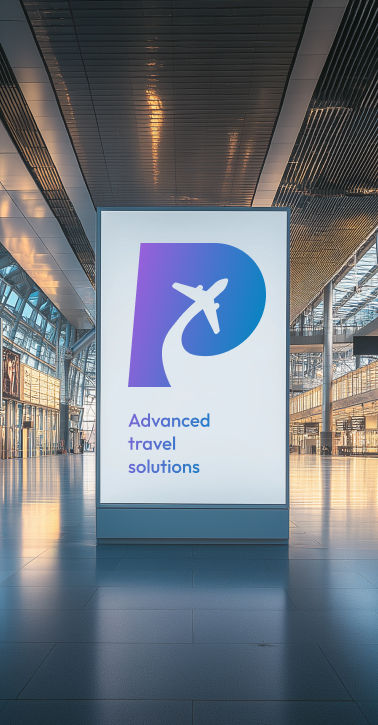
The logo needed to communicate travel, trust, technology, and continuity without falling into generic aviation symbols. Early directions explored clouds, location marks, and global travel references. The final direction moved toward a geometric mark based on Fibonacci proportions, combining aircraft movement with the letter “P” to create a clearer and more flexible brand asset.


04 / COLOR STRATEGY
A digital blue system with a modern purple signal
Blue remained the strategic anchor because it connects PELEG to trust, aviation, open skies, and Israeli blue-and-white identity. To avoid a generic travel-tech look, the palette shifts toward a sharper digital blue, supported by purple as a modern secondary color for highlights, product states, and system differentiation.

05 / PRODUCT FOUNDATION
Turning the brand into a practical product foundation
The rebrand was not designed as a marketing layer only. It became a practical foundation for dense B2B interfaces: bilingual Hebrew-English workflows, status-heavy tables, operational alerts, financial rules, and repeated decision points. Material Design conventions helped translate the identity into clearer hierarchy, components, forms, tables, review states, and scalable interface patterns.


06 / ODYSSEA EXTENSION
Extending the master brand into a product identity
After defining the PELEG master brand, the same visual logic was extended into Odyssea, one of the company’s core systems. The result keeps Odyssea connected to PELEG while giving the product a clearer, more modern identity that can live inside a functional B2B interface.


07 / PROCESS STORY
The thinking process behind the rebrand
1
Audit
Reviewed legacy materials, product logos, outdated assets, and inconsistencies across PELEG’s ecosystem.
2
Align
Aligned with stakeholders on what the brand needed to communicate: trust, technology, travel, clarity, and continuity.
3
Design
Explored visual directions, refined the strongest concept, and built the logic behind the new identity system.
4
Extend
Prepared assets and product-facing rules so the identity could scale across systems, screens, and future handoff.
Before

After
08 / FINAL RESULT
A modern identity system for a legacy travel-tech company
The refreshed PELEG identity transforms the company from a fragmented legacy look into a clearer, more professional, and scalable travel-tech brand. The new system strengthens recognition, supports multiple products, and creates a stronger foundation for future B2B product design work.


